ShopDreamUp AI ArtDreamUp

Deviation Actions


Description
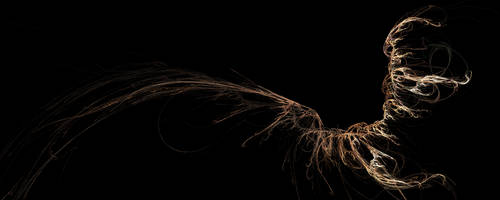
 asked for a progression on my Rebirth Flame deviation [link] so I decided to upload this
 I'm sorry I can't show what happened between 8 and 9, that's where I stopped painting and called in Photoshop for the rescue and I didn't save in between. I think I still remember what I did though.
I desaturated it (stripped it of its colours)and colourized the entire thing in yellow (I just wanted to start over with the colours).
I then painted red over the flame parts (brush set to screen), so you get this reddish glow over certain parts.
After which I painted over it with a beige colour (brush set to overlay) to make the flames appear more fiery (basically it gave more contrast and saturated the colours more deeply. And then finally I touched up bits and pieces with the dodge tool and darkened other areas with a black brush set to darken. I used dodge and darken only sparingly.
What's up with number 10 you may ask?
....
...I don't know
PRETEND YOU DIDN'T SEE THAT ABOMINATION.
~Vyrilien
Image size
3547x1000px 830.42 KB
© 2011 - 2024 Vyrilien
Comments15
Join the community to add your comment. Already a deviant? Log In
I believe number 8 looks better than 9.
9 is all red, and lost all the different color tones you worked with through all the process , and it also lost some of the technique (the movement of the brushes, the contrasts, the colors, ...). They can't be appreciated as much in 9 as in 8.
You have to start with the technique from scratch, like you did from 1 to 8. Technique should never come in the last step. If you wanted more intense colors, you should've started with them from the beginning. Still, the color palette in 8 is perfect.
9 looks like someone playing with photoshop effects. 8 is the real thing. Don't let pretty sparks impress you. Your technique is fantastic.
That's my critique, I hope it helps.
If you still have 8, can you upload it like you did with 9, please?